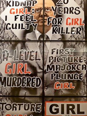


The above, sometimes framed. (Note: unlike pinning papers to a wall which is a relatively easy hang-job, putting framed items into precise grids adds extra hours to the exhibit hanging time --not for the weak preparator.)

The Big Kahuna of the grid-to-big-whole aesthetic: Gilbert and George --showing boldly at Lehmann Maupin's Chelsea site.

More trends:
Granular floor coverings.

iPhone influence --not just flat screens, but also the proportions and aspect ratio and even the rounded corners are appearing.

Millefiori paint effects --either by sanding away lavers of paint or by piling up dots of color.

Multicolored light bulbs attached to things.

Still going strong: one-liners --especially in neon.


Adult playgrounds.

Blaze orange paint (not pictured).
(Photos by Ward.)
- - -
Top
ARTicles page
- - -


